ILLUSTRATED VECTOR MAP.// learners journey log
- Harshita Sood
- Nov 20, 2020
- 2 min read
Updated: Mar 23, 2021
Illustrated Glossary
Abstraction: use of shapes, texture, effect in a artwork. The artwork does not represent reality

Balance: to make a design feel stable with distribution of colours, objects, texture.
Emphasis: to create a focus on one point

Harmony : elements of design fits together

Translating my vision into map
From starting I was very clear that I want my map to be peaceful and clean. I worked with different brush styles. Even though I was not really happy with the outcome but the journey through this made me realize several understanding of the way it works.

Discussion Forum
My comments.


Use of colours

I chose pastel colors to give peaceful and sorted look. also this gave cool and a happy kind of look like i wanted.
Principles of Design
I tried to create emphasis using dots. it gave the map a bit crowded type of look.

Working with Digital Platform
Advantages:
Varieties of textures: it provides you varieties of different textures to experiment with and helps you to give more real feel to your work.
Unlimited colour options: it provides tons of varieties of colour options with shades and tints and also you can choose any colour from outside to with the help of eyedropper tool.
Gradient tool: with the help of gradient you can work with different colour combinations which give realistic effect to your work.
Undo ctrl +Z : it helps to reverse your last action and you can reverse more than one action.
Disadvantages
going through so many colors can lead to confusion. also, working on laptop or pc can give severe headache and stress.
REFLECTION
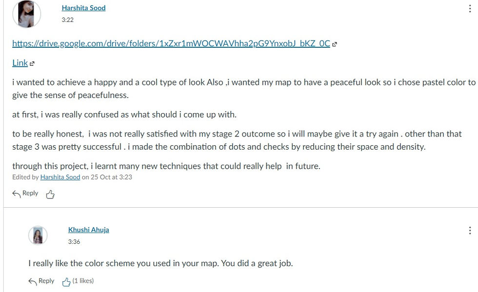
I wanted to achieve a happy and a cool type of look Also ,i wanted my map to have a peaceful look so I chose pastel color to give the sense of peacefulness.
at first, I was really confused as what should i come up with.
to be really honest, I was not really satisfied with my stage 2 outcome so i will maybe give it a try again . other than that stage 3 was not even close to what i thought. I made the combination of dots and checks by reducing their space and density.
through this project, I learnt many new techniques that could really help in future.
redo of stage 3

So , I chose making stage3 again because I wasn't much happy with the process .
here, I tried using shades of one color only to enhance the look of vector map. i also tried to create emphasis .
the redo of stage 3 has helped me to know more about illustrator and I got to know where I was lacking . This has helped to know where I went wrong in creating the design .
In this , I played with several shades of purple and took it forward trying to create emphasis.
I am bit satisfied with this.


Comments